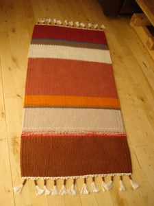
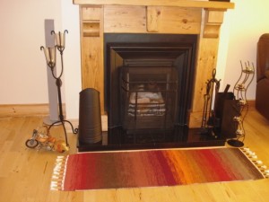
This client wanted a hearth rug, and on my visit to her home discussed the possibility of a hearth “dressing” (narrower than a rug) given the space available, complimented by two occasional rugs in the room to create balance within the longish space.
Flame colours seem an obvious choice for a hearth rug, but it just happened that the two other colours she had already minimally represented (and wanted accentuating) in the room were a burnt orange/red and dark brown. She bravely agreed to add a “rogue” colour into the design, in this case turquoise, to be added only to the occasional rugs. Sometimes, as in this case, the single-tonedness of a colour scheme only comes alive when juxtaposed with a dash of something a little challenging to the eye.
I made several designs for her to choose from and the ones chosen involved the following criteria
- The blended technique for in front of the fire reflected the lack of definition in flames
- Each of the other two rugs could be placed anywhere within the room, or even used as table runners
- Although all three rugs were different, they were all a compilation of the same colourway and tone, thus providing harmony
- They reflected floor and furnishings tones of brown.